|
|
Post by dorifutorabbit on Jun 9, 2006 18:15:50 GMT -5
RAC.  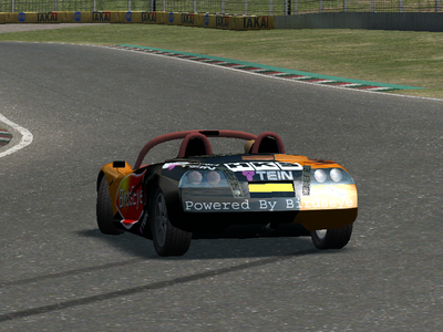  I've got some skins for the others, but this is my latest, and my best. After taking these screens, I added a D1GP sponsor box on the side. |
|
|
|
Post by dorifutorabbit on May 29, 2007 11:43:51 GMT -5
Its been a while since I posted a skin here, but here's one I've made for the fxo: 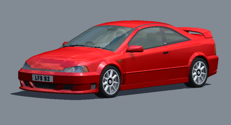 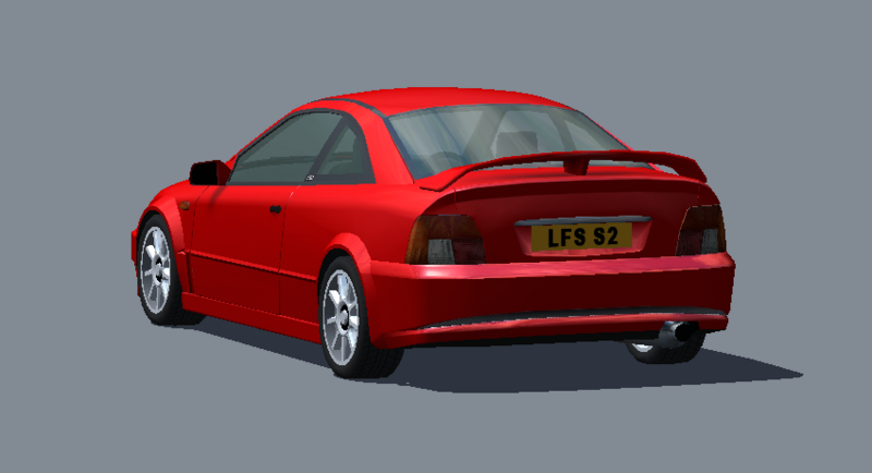 |
|
|
|
Post by Falcon140 on May 29, 2007 11:58:14 GMT -5
Uh...
What did you do to it? Paint it red?
|
|
|
|
Post by MAGGOT on May 29, 2007 13:30:55 GMT -5
The vent infront of the front wheel is not very convincing. It needs some more definition I think
|
|
|
|
Post by dorifutorabbit on May 30, 2007 13:00:41 GMT -5
|
|
|
|
Post by MAGGOT on May 30, 2007 15:47:45 GMT -5
I'm not really sure, to be honest. Maybe get some input from Robbymac, he's good with body details.
|
|
|
|
Post by robbymac on May 30, 2007 17:02:45 GMT -5
I've not messed with this body yet. But looking at what youve done, I'd say maybe make that front vent (in front of front wheel well) darker. the silver/grey sticks out a bit much compared to the other front vents. I realize its supposed to be a grill of some sort in there, but perhaps darker, so it looks deeper. On the other two (between the wheel wells) I'd maybe make them longer at the bottom, so that the top of the vent/duct is say 4" but the bottom would be around 6" in length. THis way your wheel well flares line up with the duct work, but it'll look like the lower body curls inward, and not so 'squarish'. The rear, I'd lose alltogether. Or maybe, didvie it into multiple vents/ducts with multiple vertical body colored sections in it. Also, make it darker. Then again... I dunno what the hell im talking about half the time lol I think it looks pretty good as is. My comments are only small details I'd refine if I were to have developed the same bodykit. as it stands, youve made it more difficult for me to come up with something different.  |
|