|
|
Post by Bunta on Dec 21, 2005 18:04:31 GMT -5
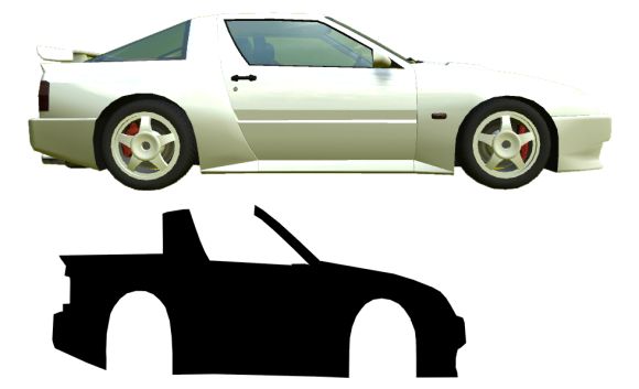
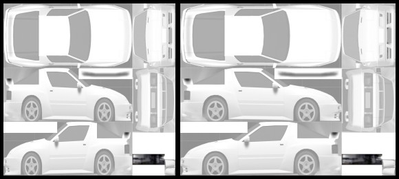
You may notice some stretching and distortion on some of your skins and wonder what's going on. After all, the skin looks fine in your graphics program, why are your decals stretched out of shape in-game? The image on the right shows the XRT as it appears in the game from side on. Below it in black we see the difference in proportions to the actual skin file. The skin file is of square proportions, but of course the cars are not. Areas of the skin file are mapped to the 3D model and in some places it is stretched across an area of the car causing distortion or stretching.
Obviously any artwork applied to the default will appear stretched in-game. We can compensate for this stretching and make all of our artwork and decals appear as they should, unstretched. Some areas of the skin will be prone to more stretching tha other areas. Pay particular attention to bumpers, wings, guards etc, as well as the areas close to the nose and tail. These areas may stretch a little more than the overall skin and this is simply due to the way the 2D texture needs to wrap around the 3D model. | |  | | | | | The first image is the skin at its default proportions, on the right the
skin is stretched to more realistic proportions.
Although there is no magical "perfect" ratio to use, we can get most of it right by doing the following: Resize your default skin from 1024 x 1024 to 1280 x 1024. Now apply your artwork and decals, then resize back to 1024 x 1024 before saving as a JPG. This should compensate for most stretching. | |  |
|
|
|
|
Post by smax on Dec 21, 2005 18:12:08 GMT -5
Now why didn't I think of that?  Neat tip, thank you, I should have realised the aspect ratio was closer to 4:3 than 1:1 |
|
|
|
Post by Bunta on Dec 21, 2005 18:16:11 GMT -5
Just remember that in some places stretching will be more. Check areas like bumpers and around the nose and tail. Individual decals may need a little bit of nudging (squishing  ) before they will look right. To test an area paint a circle on the area and check it in the viewer. It's easy to tell if a circle is out of shape in any direction. |
|
P1LOT
New Member

Posts: 3
|
Post by P1LOT on Jan 12, 2006 6:21:20 GMT -5
To try and get the logos a little more accurate, I worked out the amount of stretching for each side of the car - see the attached file. stretching.pdfHope this helps  |
|
orre
Skinner
 
Posts: 98
|
Post by orre on Jan 12, 2006 9:45:57 GMT -5
But if i skin in 2048 is there somthing to rezize it to there to so it looks good??
|
|
|
|
Post by Bunta on Jan 28, 2006 23:46:10 GMT -5
But if i skin in 2048 is there somthing to rezize it to there to so it looks good?? Since 2048 is exactly double 1024, you can deduce that 2560 is exactly double 1280. Therefore the formula for compensating while skinning at 2048 x 2048 is: Stretch the skin to a size of 2560 x 2048. Apply your art work. Resize back to 2048 x 2048. |
|
|
|
Post by hzlab on May 12, 2006 9:20:55 GMT -5
one thing also to keep in mind as is starting to become more and more common on race cars is that decals and such are deliberately stretched to be recognisable at more angles, think of a sporting event, quite often you see advertising on the field that looks perfect to the camera, but when they show a different angle, or you are actually there, it is distorted. Seeing as 90% of the time race cars on camera are not "directly side on" a lot of advertisers are realising that by stretching the decals horizontally they are increasing the time their advert is recognisable to the camera. Its a trend that is growing and growing. Admittably not all areas of the car would be stretched, mainly along the side of the car, and again, not all of the decals would be stretched. Just something to keep in mind.
i see more and more real life race cars using this in the future.
p.s. If you do this, you'll still get people point it out and tell you your skin is stretched..lol
|
|
|
|
Post by Al Heeley on May 12, 2006 10:10:29 GMT -5
I thought that was an electronic overlay onto the tv image of the pitch, such as seen on international cricket or football event?
|
|
|
|
Post by hzlab on May 12, 2006 10:30:51 GMT -5
I thought that was an electronic overlay onto the tv image of the pitch, such as seen on international cricket or football event? sometimes it is yes, i know international cricket used the overlay technique quite a bit going back 2 years or so, games in england used to do it a lot, but the majority of the time it is actually painted on slightly distorted so it looks perfect to the camera. |
|
|
|
Post by turbodad on Jul 18, 2008 14:17:36 GMT -5
To try and get the logos a little more accurate, I worked out the amount of stretching for each side of the car - see the attached file. stretching.pdfHope this helps  If using the above pdf to resize logos , should i start with 1024 x 1024 or 1280 x 1024? I presume 1024 x 1024 because using the pdf I would be altering each logo already for it's specific location ? |
|
|
|
Post by Bunta on Jul 18, 2008 20:14:53 GMT -5
The pdf doesn't work for me. Not sure if this info will help or not, but sometimes I do pre stretch (squash) logos before applying them. Sometimes they will still need a little adjustment later, but since I am working in vector anyway it's no problem.
So, adjusting a bunch of logos to generally compensate for stretching before even placing them on your skin is not a terrible idea at all, but in a few places you might not be totally satisfied with the results.
|
|