|
|
Post by BrentS on Jun 23, 2008 14:49:15 GMT -5
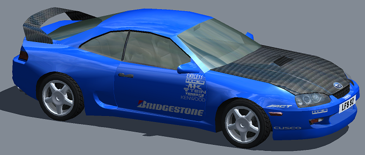
So I decided to finally start one of these. I'm nowhere near the caliber of some of you guys, but with time I hope to get better. First paint here is one out of boredom. Was on Dangeruss's site and saw a nice STI he did. So I decided to try it out for RF. RB4 felt like the best template for it. It's simple and to the point.  20481024 (remove from name) 20481024 (remove from name) |
|
|
|
Post by TsunamiSephi on Jun 23, 2008 21:21:45 GMT -5
That's a really good start. Some pointers though:
Your carbon fiber weave is too large, find a better one to copy from, or shrink it just a bit.
Also, a little thing that caught me. the Subaru badge on the hood/front should be at about half that size, but that's just my opinion.
It's good to see some fresh upstarts here on master skinnerz. Welcome and enjoy your stay.
|
|
|
|
Post by BrentS on Jul 1, 2008 9:59:57 GMT -5
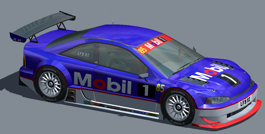
A different take on a Mobil 1 car. As you guys see, I like to keep my schemes simple  2048 2048 |
|
|
|
Post by MAGGOT on Jul 1, 2008 10:40:33 GMT -5
I recommend you stay away from fully saturated colours. The blue and red look unrealistic, far too saturated, you just don't see that in real life.
|
|
|
|
Post by TsunamiSephi on Jul 1, 2008 17:30:51 GMT -5
*Agrees with Maggot* Mature up your colors a little and it would improve it greatly. Great step forward from the last skin posted. Just keep working on it.  |
|
|
|
Post by BrentS on Sept 8, 2008 15:18:43 GMT -5
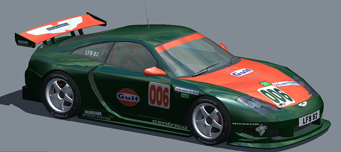
Did this one after watching LeMans and totally forgot about it. I'm not one to do crazy cars, so I stuck to leaving this one simple  >2048< >2048< |
|
|
|
Post by Bunta on Sept 9, 2008 9:23:02 GMT -5
You are doing some nice work here, I can see that your skins are getting better. I like your understated approach. Perhaps add a little more detail around the rear guards would be good, just to balance things out a bit.
|
|
|
|
Post by MAGGOT on Sept 9, 2008 9:25:17 GMT -5
I appreciate the understated approach, as Bunta says. However, the lack of an eye catching paint scheme means you really need to step up the detail work to make a cracking good skin. Have a look at a lot of pictures of different GT style race cars and pick out the details you can see on the exterior. Things like rivet spots, fuel doors, safety stickers, bracket mounts, tow hook arrows, etc etc.
|
|
|
|
Post by teazR on Sept 9, 2008 11:20:04 GMT -5
Be careful with the logo's and how they stretch on different panels.
The o on Mobil should look like a circle not an oval. Same goes for the orange circle on the Gulf logo.
|
|
|
|
Post by Vilante on Sept 23, 2008 23:26:01 GMT -5
Good constructive crits from the lads. I'll just add that I think you've made a good start, keep at it, spend time on your skins and you'll see some great results.
|
|