|
|
Post by Falcon140 on Jan 14, 2009 19:58:56 GMT -5
Just wanted to get some opinions on the design. 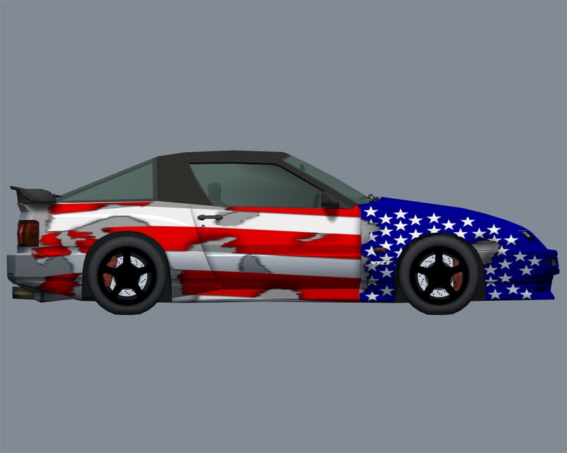 |
|
|
|
Post by Bunta on Jan 14, 2009 23:33:45 GMT -5
In my personal view, that flag would look better if it was burning. But you probably won't find my opinion to be very useful in this case.
|
|
|
|
Post by Falcon140 on Jan 15, 2009 0:11:07 GMT -5
I really don't think burning an American flag will be helpful to an American team.  |
|
|
|
Post by Bunta on Jan 15, 2009 0:40:57 GMT -5
I really don't think burning an American flag will be helpful to an American team. You will never know until you try. ;D |
|
|
|
Post by MAGGOT on Jan 15, 2009 12:50:11 GMT -5
I think the dropshadow should be larger, it's not very apparent at this point. The rear end I think should be a little more tattered as well.
Nice work thus far, though. I wish the Canadian flag was as easy to make look good on a skin as the American flag...
|
|
|
|
Post by Falcon140 on Jan 15, 2009 18:02:08 GMT -5
Thanks for the tips. I was thinking about having pieces of flag kinda carry over to the rear; like they were flying off, ya know? Thoughts?
|
|
|
|
Post by robbymac on Jan 15, 2009 22:41:36 GMT -5
imo waving would be good, because right now it looks like a brand new hot off the press stright from the dry cleaners flag that smoehow got holes in it.
a waving flag makes the skin much more difficult to accomplish, but I think would help to portray the 'depth' much better (helping your tears and holes fit into the design bettah)
|
|


 But I found a link you were looking for, check your last post.
