|
|
Post by inCogNito on Jan 9, 2005 6:02:02 GMT -5
We got these new windscreen decal on the S2 cars, but does anybody know how to bend a logo properly?
I know how to bend Text in PS, but a layer? I use Filter->Distort->Shear as a workaround, but that not 100% right.
Any ideas?
|
|
|
|
Post by Bunta on Jan 9, 2005 7:26:26 GMT -5
In Corel it is easy to bend text, but bending a logo is not really possible. It is possible to create an envelope of the shape I want then put the logo inside, but it is not the same as it would be if you painted it on to a real car.
The 3d models are, of course, not realy curved, they are made up of straight edges, triangles actually. This means that as long as you follow the lines of the 3d model your work should look ok on the "curved" part. Check out a wireframe of that car to see where the lines are.
I'm sure some of our Photoshop gurus will have some handy tricks for this part of the skin.
Which logo are you trying to apply? Perhaps I can help?
|
|
|
|
Post by inCogNito on Jan 9, 2005 7:37:12 GMT -5
I have no special logo in mind, it's a general problem.
I think everyone has to face this problem, it would be nice to have a solution that works for all types of logos.
|
|
|
|
Post by ShannonN on Jan 9, 2005 8:26:32 GMT -5
We got these new windscreen decal on the S2 cars, but does anybody know how to bend a logo properly? I know how to bend Text in PS, but a layer? I use Filter->Distort->Shear as a workaround, but that not 100% right. Any ideas? I'm a bit confused? Bend a logo ? sunstrips are for putting a name on whether it's a sponsor, driver or even webpage just as text most ppl just use bezier tool etc to create path and add/attach text to path to bend text I can't see why you'd put a logo (image) on such a small area of display? Many programs will allow you to "paste inside another object" so I guess you could carefully cut out a copy of the sunstrip, then paste your logo inside the sunstrip and overlay that doctored strip onto original if you follow what I mean? Maybe I've misunderstood your question? Cheers ShannonN |
|
|
|
Post by inCogNito on Jan 9, 2005 8:33:47 GMT -5
I'm a bit confused? Bend a logo ? sunstrips are for putting a name on whether it's a sponsor, driver or even webpage yes, but a name could a logo, too. If i want to put a Vodafone on the sunstrip like in DTM for example, i cannot type this just with another font. With logo i just meant a non-vector image. I'm working with Photoshop CS, maybe you can explain how to do this in PS? thanks anyone. |
|
|
|
Post by Bunta on Jan 9, 2005 9:55:47 GMT -5
I have no special logo in mind, it's a general problem. I think everyone has to face this problem, it would be nice to have a solution that works for all types of logos. Well I have a solution, but not using PS. I would just recreate the logo to suit that shape. Some would be reasonably easy, others not so. |
|
|
|
Post by MAGGOT on Jan 9, 2005 11:37:02 GMT -5
I think Bunta's point with the straight edges is the best solution. If the logo is curved, it won't flow with the windscreen properly and will look odd (usually). If you make it follow the lines of the model (the straight edges) it will look much better. For logos made up of primarily text, this is usually not TOO much of a problem, but for picture logos..... you're on your own  MAGGOT |
|
Linsen
Grand Master
Posts: 190
|
Post by Linsen on Jan 9, 2005 11:53:08 GMT -5
unfortunately i don't have a better solution either. what i always do is, select the part of the logo that needs to be adjusted choose free transform-->perspective and make it align with the sunstrip lines. it is a little annoying, because you usually have to do it four times for just one logo (two different angles on each side of the sunstrip) but the result is pretty much perfect if you do it precisely. it would be great if anyone came up with a more or less automatic solution, though  . |
|
|
|
Post by Bunta on Jan 9, 2005 18:26:13 GMT -5
I think Bunta's point with the straight edges is the best solution. If the logo is curved, it won't flow with the windscreen properly and will look odd (usually). If you make it follow the lines of the model (the straight edges) it will look much better. For logos made up of primarily text, this is usually not TOO much of a problem, but for picture logos..... you're on your own MAGGOT Indeed if you make a perfect curve it looks shitty. But I noticed too, that no matter what method you use, from some angles it will still look a little strange. This is because of the straight lines of the polygons. I can't find a perfect way of doing it but following the lines looks good from most angles, a real curve only looks good (great) from certain angles as it doesn't follow the contours exactly. *I contemplated making several decals for the windscreens but then I realised the time involved to make enough of them for variety. If I just made a few brands then we would see them on several skins, and that I wouldn't want. |
|
|
|
Post by Bunta on Jan 9, 2005 19:19:11 GMT -5
 this is my vector Michelin decal which I have shaped to the exact lines of the polygons on the 3D mesh. It is a little blurry due to stretching, but there is nothing anyone can do about that. This method is far better than using a real curve. From almost every angle it looks right.  Here you can see how I have adjusted the "H" so it bends with the model. 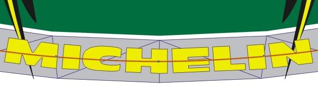 I have rotated the image ninety degrees so you can see the result better. *I should say also that this is just a quick job, I could make it a little better with more patience. This is not a font it is a picture, a vector image made by hand. This could be any picture at all. Text shapes are easier to work with due to their perpendicular (-ish) nature, they can be moulded to the straight lines easily. Notice also in many motor racing liverys that text is often blocky and bold, square, rather than flowing italics. There are exceptions of course, but bold strong fonts usually look better on a racecar than something more elaborate. |
|
Tweak
New Member

Posts: 3
|
Post by Tweak on Jan 10, 2005 1:13:45 GMT -5
If you have a bitmap image, yeah it is hard to do. But you are so limited with possibilities for a bitmap. I find (if possible) that recreating the logo in vector is the way to go, then bending is possible in most applications.
But if you have a bitmap, you should try using a program that has "mesh warping" that way you can do the bending properly and it will all work symmetrically. Most applications have it, but some have odd options for the desired effect.
I know Corel Photo Paint has it, but I don't know if earlier versions (10 or under) have any of the new options newer releases say they come with.
|
|
|
|
Post by Al Heeley on Jan 10, 2005 10:59:09 GMT -5
In photoshop, if you simply type with the desired font, theres a little special effects button you can click on to give the text a little arc. Then I rotate anti-clockwise 90 degrees and stick it in place.
It takes a little suck-it-and-see depending on the text size and length to get the arc right, but its really simple and looks fine.
If its a bitmap, like a logo, I too have been using the distort>shear function, which is more hit-and-miss and generally needs a bit of rotation and perspective tweaking to get it to look right. Not ideal, but workable.
|
|


 .
.


 But I found a link you were looking for, check your last post.